|
Digital meets Culture https://www.digitalmeetsculture.net/article/training-students-in-the-creation-of-a-visual-identity-for-the-local-cultural-heritage/ Export date: Sun Jun 28 9:19:12 2026 / +0000 GMT |
Training students in the creation of a visual identity for the local cultural heritage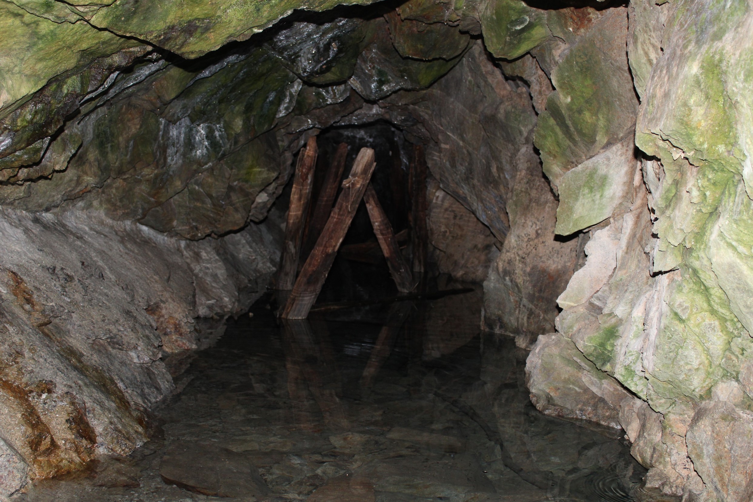 The mining site in Spania Dolina - photo by Pietro Masi CC-BY-SA Matej Bel University is coordinating an impressive action for territorial and tourist promotion in the INCULTUM Pilot 3 Mining Treasures of Central Slovakia in the region which has significant cultural and technical heritage related to its mining history. As part of this work, a new website was recently developed in the Pilot to offer information and other servics that promote the area and its touristic offer. In the context of this action, in the period February-march 2022 a creative training for the University students was organised together with the ICT company that is in charge of the web platform, with the scope of engaging students in a challenge to create proposals for the logo and visual identity of the website “Mining Treasures of Central Slovakia” (mining treasures = banícke poklady). Elements of the visual identity The main communication channel is the website, which already has a predefined font and colour palette. These two brand codes should be used in the resulting visual identity and should not be replaced by other colours and fonts. Training for logo design: The mining treasure logo should have an information function, not a communication function. A logo is not a sentence; a logo is a period at the end of a sentence, therefore, it must meet the following criteria:
Outcomes Based on the training received, 31 students created small working groups and worked several weeks independently on the visual identity of the mining treasures. Their work led to the creation of 19 proposals for the visual identity, logo, and design manual of the interactive mining treasures platform. Numerous interesting and relevant proposals for the logo were received, so it was quite challenging to choose the winning logo that will represent the “Mining Treasures of Central Slovakia” (mining treasures = banícke poklady). The winning logo design is: The logotype consists of the abstract symbolism of mining, a hammer, which is interspersed with a cross as a sign used in the context of marking a place, a goal, etc. (treasure). The logotype as a whole thus refers to the discovery and wandering of "mining treasures". The winning logo design was modified by the designers into the final form that we use on the platform, social networks, in presentations, materials, and documents. The winning logo was embedded with a pin symbol, which we use to indicate activity on the platform map. The pin sign also appeared in other student logo designs. Number of students trained: 31 Number of proposals for visual identity: 19 Final visual identity and logo design: 1 Language: Slovak All students who participated in this training received participation certificates. |